Mastering Dark Mode in Web Design: Pros, Cons & How to Implement It

Explore the pros, cons, and best practices of dark mode in web design. Learn how to implement it effectively for better UX, accessibility, and visual appeal.
Table of Contents
In today’s digital landscape, user preferences are shaping how websites are designed and experienced. One of the most talked-about and adopted design trends in recent years is dark mode. No longer just an aesthetic choice, dark mode offers a different user experience—one that’s easier on the eyes, more modern, and energy-efficient in some cases. But like any design decision, it has its advantages and drawbacks.
In this blog, we’ll explore the pros and cons of dark mode in web design, and offer practical guidance on how to implement it effectively, ensuring your site is both functional and visually stunning in the dark.
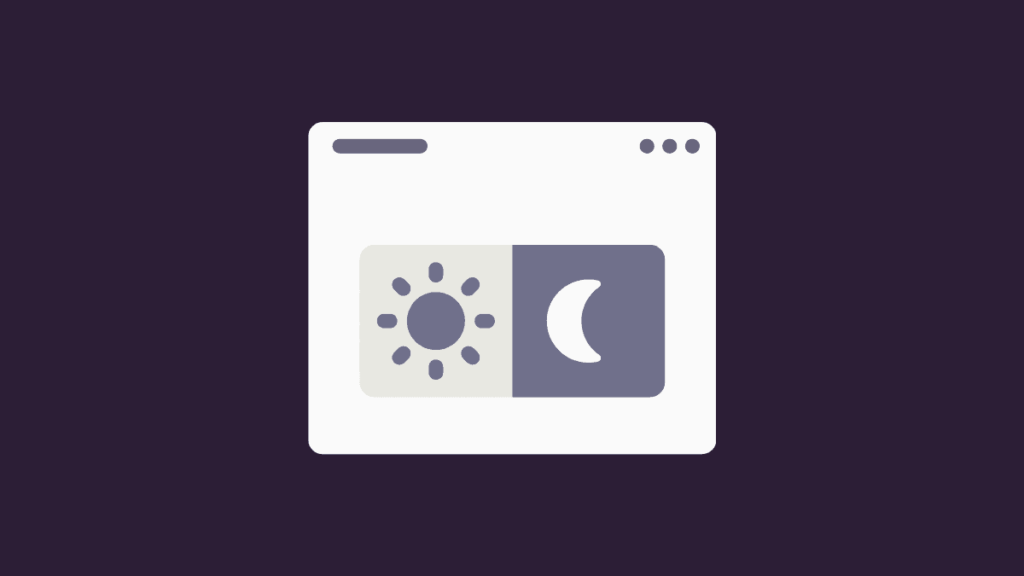
What Is Dark Mode?
Dark mode (or night mode) is a user interface setting where the background is dark—typically black or deep gray—and the text and elements are light. It contrasts with the traditional light mode that features dark text on a white or light background.
This feature has become a staple across operating systems, apps, and websites, thanks to increasing demand for reduced eye strain and personalized user experiences.
The Pros of Dark Mode in Web Design
1. Reduces Eye Strain in Low Light
Dark mode is particularly helpful in low-light environments. It minimizes blue light exposure and glare, making it easier for users to focus for extended periods. This is especially beneficial for users who spend long hours on screens, such as developers, designers, or readers.
2. Modern and Stylish Look
Dark themes often feel sleek, elegant, and futuristic. When done correctly, they convey a high-end aesthetic, making them popular in industries like tech, fashion, and creative portfolios.
3. Improved Battery Life on OLED Screens
For mobile users, dark mode can save battery life on devices with OLED or AMOLED screens. These screens turn off pixels completely to display black, reducing power usage compared to light backgrounds.
4. Accessibility and Focus
Dark mode can help highlight important UI elements by reducing visual noise. With fewer distractions, users can focus more easily on content, especially in applications or dashboards that require concentration.
5. Meets User Preferences
Dark mode is often a user-driven feature. Allowing users to toggle between dark and light modes increases customization and satisfaction, catering to diverse preferences.
The Cons of Dark Mode in Web Design
⚡ 2-minute scorecard · instant result
Is your website quietly costing you leads?
Answer 5 quick questions. Get your score + the top fixes — free.
1. Does your site load in under 3 seconds on mobile?
2. Is there one clear call-to-action above the fold?
3. Is your main lead form 5 fields or fewer?
4. Is the whole site genuinely mobile-friendly?
5. Are trust signals (proof, reviews) near your CTA?
1. Readability Issues
While dark mode reduces eye strain in dim environments, it can do the opposite in brightly lit conditions. White or light text on dark backgrounds can cause halation (a visual distortion), making it harder to read.
2. Poor Contrast Choices Can Harm UX
Achieving the right contrast balance is challenging. If the contrast is too low, it compromises readability. If it’s too high, it becomes jarring and uncomfortable. Designers need to tread carefully to ensure good user experience.
3. Not Ideal for All Brands
Dark mode may not suit every brand’s identity. Brands with a light, vibrant, or youthful feel might find it hard to translate their personality into a dark theme without compromising their visual integrity.
4. Extra Development Work
Implementing and maintaining both light and dark themes can increase the complexity of web development. Designers must ensure all components function and appear properly in both modes, which can mean more testing and support.
When to Use Dark Mode
Dark mode isn’t a one-size-fits-all solution. Consider using it when:
- Your target audience is tech-savvy or spends long hours on screens (e.g., developers, gamers).
- You’re creating a dashboard or tool where prolonged focus is required.
- Your brand identity aligns with sophistication, luxury, or modern minimalism.
- You want to offer customization and improved accessibility for users with visual sensitivities.
If your website is content-heavy (e.g., news, blogs), it’s worth considering how readability may be affected before adopting a dark theme.
How to Implement Dark Mode in Web Design (Without CSS Code)
1. Start with a Design System
Before writing any code, build a comprehensive design system that includes color variables for both light and dark modes. This helps maintain consistency across your site and simplifies the design-to-development workflow.
Create two color palettes:
- Light Mode: Dark text on light backgrounds
- Dark Mode: Light text on dark backgrounds
Assign these palettes to variables (e.g., primary-background, text-primary) so they can be easily toggled later.
2. Use Color Tokens, Not Hardcoded Values
Instead of defining colors directly in your UI components, use tokens or named variables that reference your theme system. This makes it easier to switch themes without rewriting styles.
For example:
- –background-color
- –text-color
- –button-bg-hover
3. Design for Contrast and Accessibility
Ensure all color combinations meet WCAG (Web Content Accessibility Guidelines) standards. Use contrast checking tools to test how your light text stands against dark backgrounds, aiming for a contrast ratio of at least 4.5:1 for body text.
Also, think about:
- Highlight states
- Hover effects
- Shadows and elevations
- Focus indicators
These elements often behave differently in dark mode and should be tested thoroughly.
4. Implement a Theme Toggle
Provide a simple toggle button that allows users to switch between light and dark modes. Store the user’s preference using local storage so the theme persists across sessions. If you’re working with a CMS or JavaScript framework, this can be managed easily through theme state handling.
5. Test Across Devices and Lighting Conditions
Dark mode should be tested just as rigorously as any other design element. Make sure it looks good and functions well across various screen sizes, brightness settings, and ambient light conditions.
Real-world testing will reveal how your theme performs beyond the design screen.
6. Support System Preferences
Modern browsers and operating systems allow users to set their preferred appearance mode at a system level. Implement support for the prefers-color-scheme media query so your site automatically adapts to the user’s default preference.
This provides a more seamless experience and aligns with accessibility best practices.
Best Practices for Dark Mode UX
- Avoid pure black: Instead, use dark grays for backgrounds to reduce harsh contrast and create a more comfortable reading experience.
- Use accent colors thoughtfully: Bright colors appear more vibrant on dark backgrounds, so use them sparingly to avoid overwhelming the user.
- Keep brand identity intact: Adjust your brand colors for dark mode without losing recognition. This might mean using slightly different hues or saturation levels.
- Don’t reverse UI just to match light mode: Redesign if needed rather than inverting colors blindly. A tailored dark experience often performs better.
Conclusion
Dark mode in web design is more than a visual trend—it’s a functional enhancement that, when implemented thoughtfully, can improve user experience, reduce eye strain, and offer stylistic flexibility. However, it’s not without its challenges. Poor contrast, readability issues, and brand misalignment can undermine its benefits.
To truly master dark mode, start with a strong design system, focus on accessibility, and prioritize user control. By balancing beauty with usability, you can deliver a dark mode experience that’s both elegant and effective.
Whether you’re building a high-end brand site, a developer tool, or an e-commerce platform, embracing dark mode could be the next step in elevating your design—one subtle shade at a time.

Ready to turn this into real bookings?
Free 30-min audit. We review your current setup and give you 3 specific wins — whether we work together or not. Starts at 0/month. No contract. One medspa per market.
Book My Free Audit →No credit card. No pitch. No 12-month lock-in.